Posted: 5/20/2017
Dzisiejszy post poświęcony będzie dopracowywaniu strony, której budowę rozpoczęliśmy w poprzednim poście. Wyjaśnię także, w jaki sposób można zarządzać dostosowywaniem treści do rozmiaru ekranu, na którym strona jest otwierana, czyli tzw. gridem.
Today’s post will be devoted to refining the website, whose construction we started in the previous post. I will also explain how you can manage the customization of content to the size of the screen on which the page is opened, so called grid.
Tło strony i własny arkusz stylów
We wcześniejszych pracach korzystaliśmy tylko z przygotowanych w Materialize arkuszy stylów. Pomimo ogromnych możliwości, jakie one oferują, pewne rzeczy musimy zdefiniować sami, za pomocą osobnego pliku CSS. Naszej stronie nadal brakuje wielu istotnych z wizualnego punktu widzenia elementów. Jednym z nich, który w znaczący sposób poprawi jej wygląd jest tło. Dobrym pomysłem byłoby również przytwierdzenie stopki do dołu strony. Właśnie te modyfikacje wprowadzimy za pomocą własnego arkusza stylów.
Page background and own style sheet
In earlier work we used only the Materialize style sheets. Despite the great possibilities they offer, some things we have to define ourselves, using separate CSS file. Our website still lacks many important visual elements. One that significantly improve its appearance is the background. It would be a good idea to also stick the footer to the bottom of the page. We’ll make these modifications using our own style sheet.
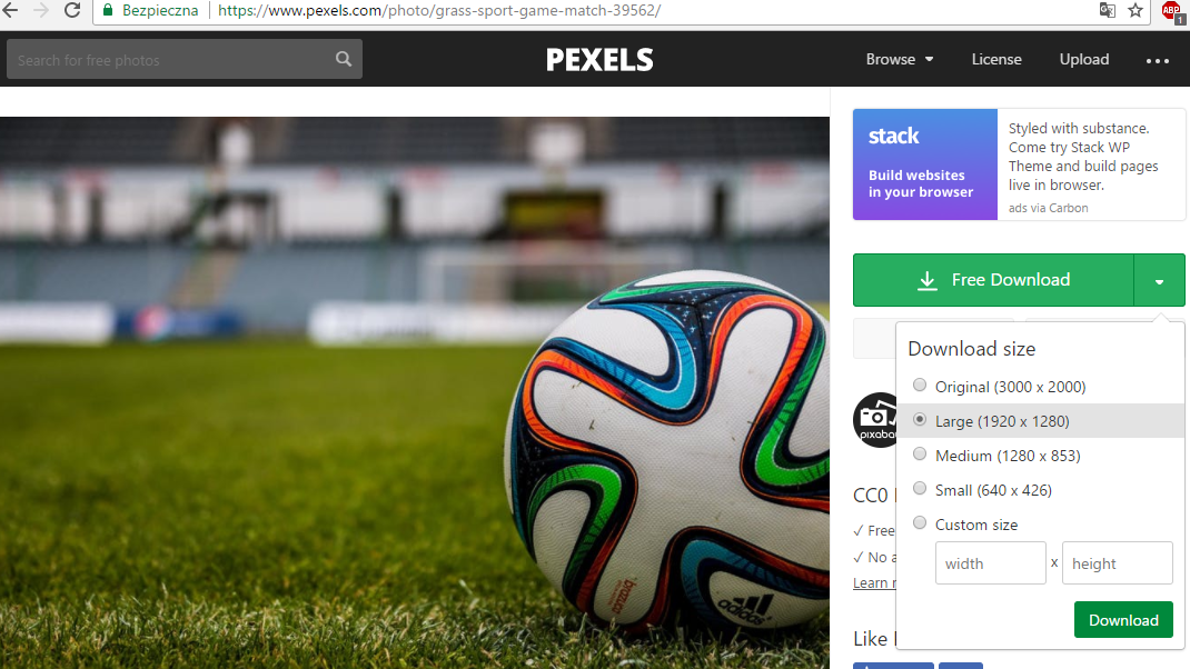
Ważne jest, aby od początku zachowywać porządek w projekcie. Stwórzmy więc osobne foldery na arkusze stylów (css) i obrazy (img). Najpierw wyszukujemy obraz, który chcemy umieścić w tle strony. Do tego celu polecam stronę pexels.com - zawiera dość dużą bazę darmowych grafik, które można wykorzystywać również w celach komercyjnych. Należy zwrócić uwagę na rozdzielczość używanych obrazów - im wyższa, tym większy rozmiar pliku, a tym samym dłuższy czas ładowania strony. Pobraną grafikę umieszczamy w folderze img.
It’s important to keep order in the project files from the beginning. So, let’s create separate folder for style sheets (css) and images (img). First, we look for the image we want to put in the background of the page. For this purpose I recomment pexels.com - it contains quite a large database of free graphics, which can also be used for commercial purposes. Pay attention to the resolution of used images - the higher the larger the file size, and thus the longer the page load time. We put the downloaded graphic in the img foleder.
Kolejnym krokiem jest utworzenie pliku mystyles.css w folderze css. Za jego pomocą dodamy obraz z folderu img na tło naszej strony. Nie jest to trudne zadanie - wystarczy dodać do pliku poniższe kilka linii kodu. Przy okazji dodałem też fragment służący do przyklejenia stopki do dołu strony - używamy do tego flexboxa.
The next step is to create mystyles.css file in css folder. With it we’ll add an image from the img folder to the background of our site. This isn’t a difficult task - just add a few lines of code shown below. By the way, I’ve also added a section to stick the footer to the bottom of the page - we use a flexbox to this.
body {
 display: flex;
 height: 100vh;
 flex-direction: column;
 background: url("../img/background.jpeg") no-repeat center center fixed;
 -webkit-background-size: cover;
 -moz-background-size: cover;
 background-size: cover;
}

main {
 flex: 1 0 auto;
}
Grid
Zanim zabierzemy się za dodawanie kolejnych elementów do strony, powinniśmy wyjaśnić sobie, w jaki sposób można zarządzać układem treści na ekranie przeglądarki za pomocą klas w Materialize. Zbudowany jest on z trzech głównych elementów: kontenerów (ang. container), rzędów (ang. rows) i kolumn (ang. columns).
Pierwszy z wymienionych w praktyce nie jest fragmentem gridu, jednak jest ważny z punktu widzenia układu elementów na stronie. Domyślnie zajmuje ~70% szerokości obszaru. Jeśli chcemy, aby zajmował całą szerokość strony należy użyć klasy container-fixed. Wewnątrz kontenera umieszczamy rzędy. Są niezbędne, ponieważ umożliwiają dzielenie znacznika posiadającego tą klasę na kolumny_._
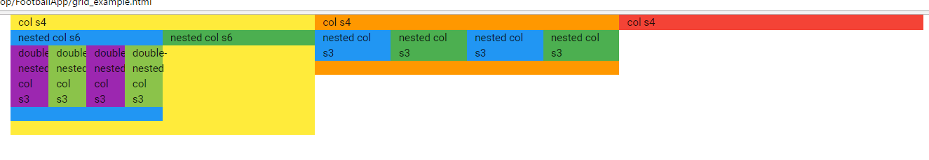
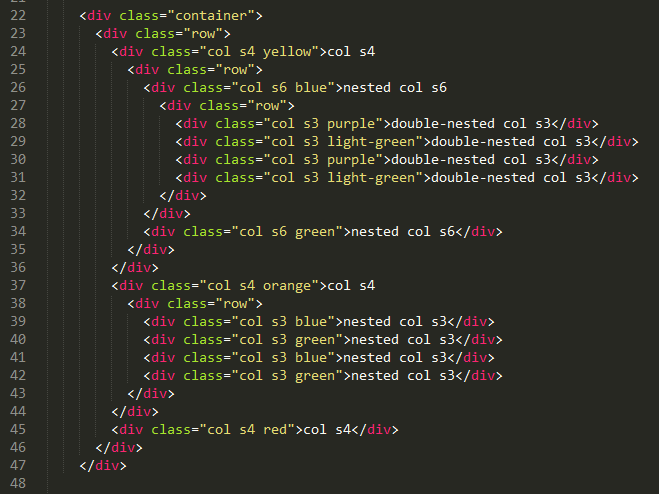
Każdy rząd ma 12 kolumn równej wielkości. Dozwolone są dowolne modyfikacje szerokości naszego “pojemnika” wewnątrz rzędu - możemy np. utworzyć trzy elementy umieszczone obok siebie, jak w przykładzie poniżej.
Before we take on adding more elements to the page, we should explain how you can manage the content layout on your browser using the Materialize classes. It is built of three main elements: containers, rows and columns__.
First of them in the practice isn’t a grid fragment, but it’s important from the layout point of view. By default it occupies ~70% of browser width. If we want it to occupy the entire page width, use the container-fixed class. Inside the container we place rows. They’re necessary because they allow you to divide the tag of that class into columns.
Each row has 12 columns of equal size. Any modifications of the width of our “container” within a row are allowed - e.g. we can create three elements placed next to each other, as in the example below.
<div class="row">
  <div class="col s4">
    <!-- Promo Content 1 goes here -->
  </div>
  <div class="col s4">
    <!-- Promo Content 2 goes here -->
  </div>
  <div class="col s4">
    <!-- Promo Content 3 goes here -->
  </div>
</div>
Co ciekawe, rzędy można w sobie zagnieżdżać. To znaczy, że jeśli wewnątrz diva o szerokości 4 kolumn, utworzymy rząd, to znów mamy do dyspozycji 12 kolumn.
What’s interesting, rows can nest within themselves. This means that if we create a row inside the 4-columns div_, we have 12 columns available._
Jednak jak to się wszystko ma do responsywności stron? Otóż w Materialize mamy dostępne 4 klasy szerokości ekranu:
- .s - small - ekrany <= 600px szerokości
- .m - medium - > 600px
- .l - large - > 992px
- .xl - extra large - > 1200px
Stosując je możemy ustalić odmienny układ kolumn w zależności od szerokości urządzenia, na którym strona jest wyświetlana. Dzięki temu nasza strona jest przejrzysta na ekranach monitorów i jednocześnie czytelna na telefonach i tabletach.
Więcej informacji na temat gridu w Materialize znajdziesz tutaj.
But how does it all come about to the responsiveness of websites? In Materialize, we have 4 device-width classes:
- .s - small - screens <= 600px width
- .m - medium - > 600px
- .l - large - > 992px
- .xl - extra large - > 1200px
By using them, we can determine a different layout depending on the width of the device on which page is displayed. This makes our website look clear on the monitors screens and is easily readable on smartphones and tablets.
More informations about Materialize grid you can find here.
Layout naszej strony
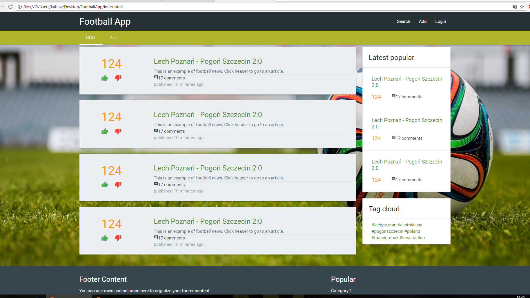
Na koniec zastosujmy zaprojektowany przez nas grid do naszej strony i dodajmy kontenery z treścią. Na dużych ekranach wybrałem układ z dodawanymi linkami o szerokości 9 kolumn oraz 3 kolumny szerokości dla Ostatnio popularnych i Chmury tagów. Na średnich i małych ekranach przechodzi on natomiast w układ o całej szerokości. Przykłady jak wygląda strona na poszczególnych urządzeniach możecie zobaczyć poniżej.
Our website layout
Finally, let’s apply the layout we designed to out site and add content containers. On large screens I chose layout with 9-column links and 3-columns widths for Latest popular and Tag cloud. On medium and small screens it goes into a layout with the entire width. Examples of how page looks like on individual devices can be seen below.
1920 x 1080
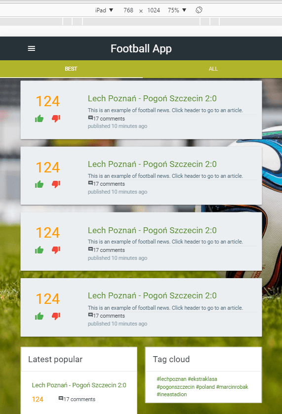
768 x 1024
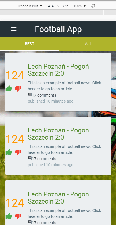
414 x 736
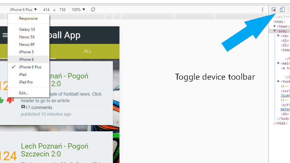
Podpowiedź: jeśli chcesz zobaczyć jak Twoja strona wygląda na różnych urządzeniach, w przeglądarce Google Chrome możesz zrobić to wykorzystując Narzędzia dla programistów (Ctrl + Shift + I). Następnie kliknij Toggle Device Toolbar. Z menu rozwijanego możesz wybrać urządzenie, które Cię interesuje.
Hint: if you want to see how your site looks on different devices, you can do this in Google Chrome using Developer Tools (Ctrl + Shift + I). Next click on Toggle Device Toolbar button. From the dropdown menu you can select the device that interests you.
Jak mogliście zobaczyć powyżej, przygotowałem już gotowe kontenery na linki, zawierające: liczbę głosów, ikony do głosowania, tytuł, opis, liczbę komentarzy oraz datę publikacji (jak na razie statyczne). Do ich budowy korzystałem tylko z Materialize. Zachęcam i Was do spróbowania samodzielnego modelowania. W razie problemów zawsze możecie zajrzeć do repozytorium z kodem źródłowym.
Powodzenia!
As you could see above, I’ve prepared ready-made containers with: number of votes, icons for voting, title, description, number of comments and pubblication date (only static so far). I only used Materialize for their construction. I encourage you to try modelling by yourself. In case of problems, you can always look at the source code repository.
Good luck!